Solano Labs CI Session View
Solano CI is a continuous integration product for software development teams.
Overview
Context
Solano Labs’ Solano CI is a platform for engineers that provides a critical function called continuous integration. Solano CI enables Agile software teams to break down large monolithic applications into smaller projects and services which can be rebuilt, tested, and deployed more frequently.
Engineering teams rely on continuous integration and testing tools to manage complex software development life-cycles. If these mission-critical tools introduce frictions or inaccuracies of any kind that result in delayed or broken software release, this can cause expensive missed go-to-market opportunities.
Problem
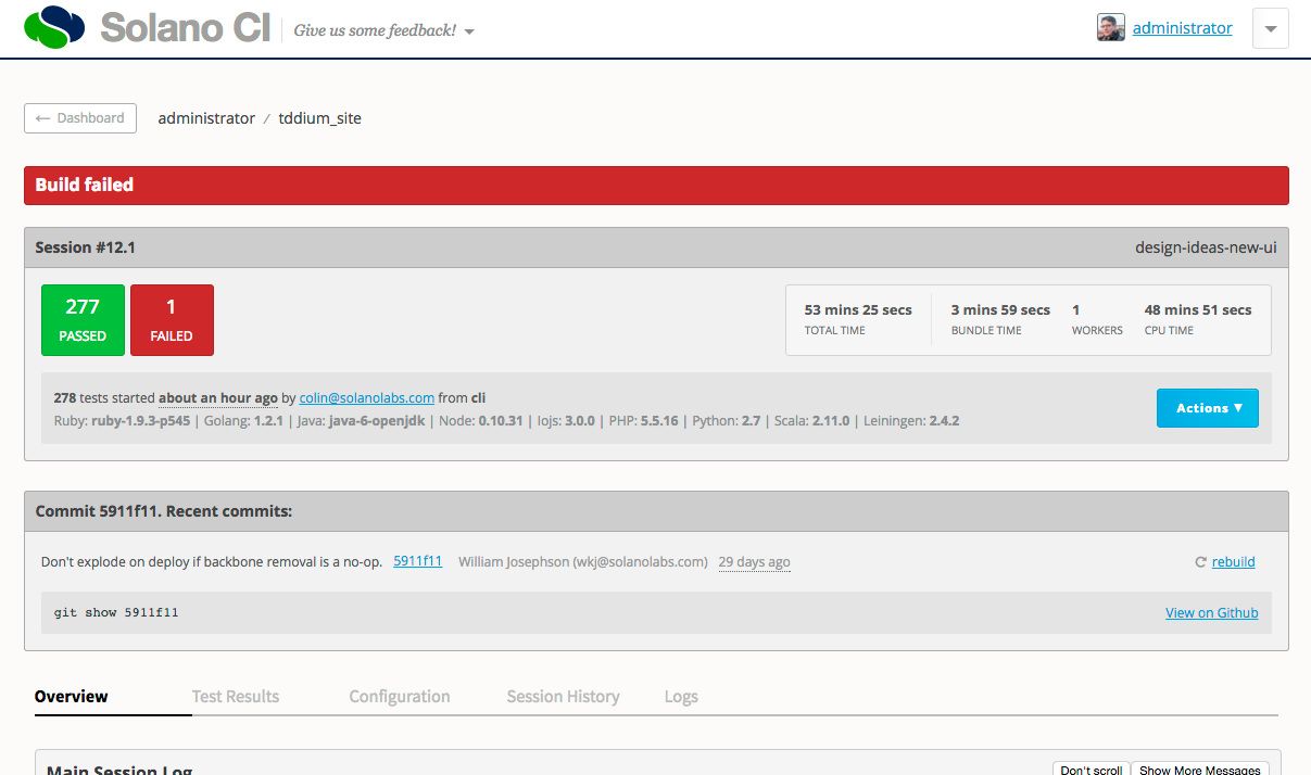
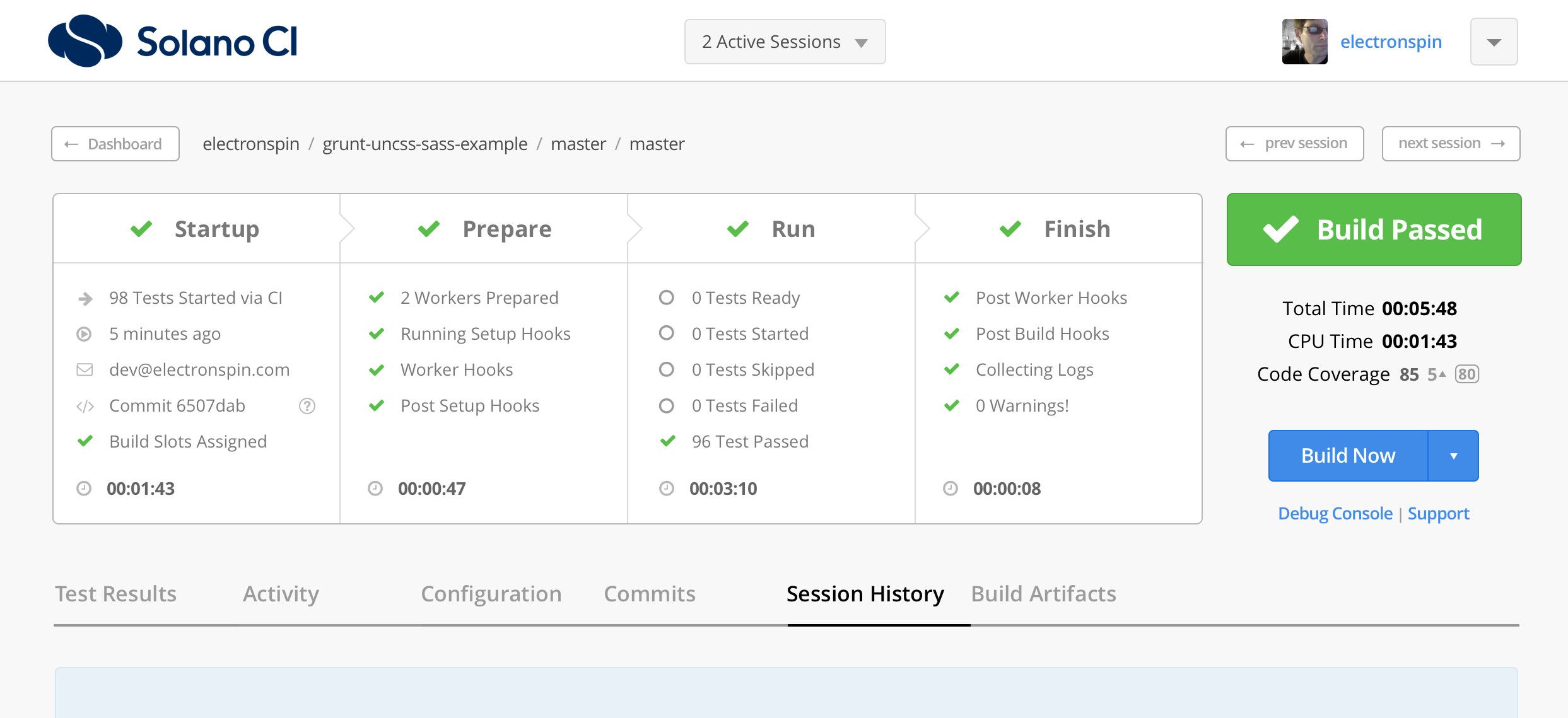
The Session View—the core of Solano CI—is a comprehensive real-time report of build progress and test results for a single software project. Since its initial release incremental changes to the system cause increasing usability and technical issues, the most critical being diminished trust in reporting accuracy.
Through research and testing with customers we found there were four areas we needed to improve:
- Unclear presentation of build status.
- Poor accuracy of reporting data.
- Low user trust in the build system.
- Inconsistent views across different session types.
Outcome
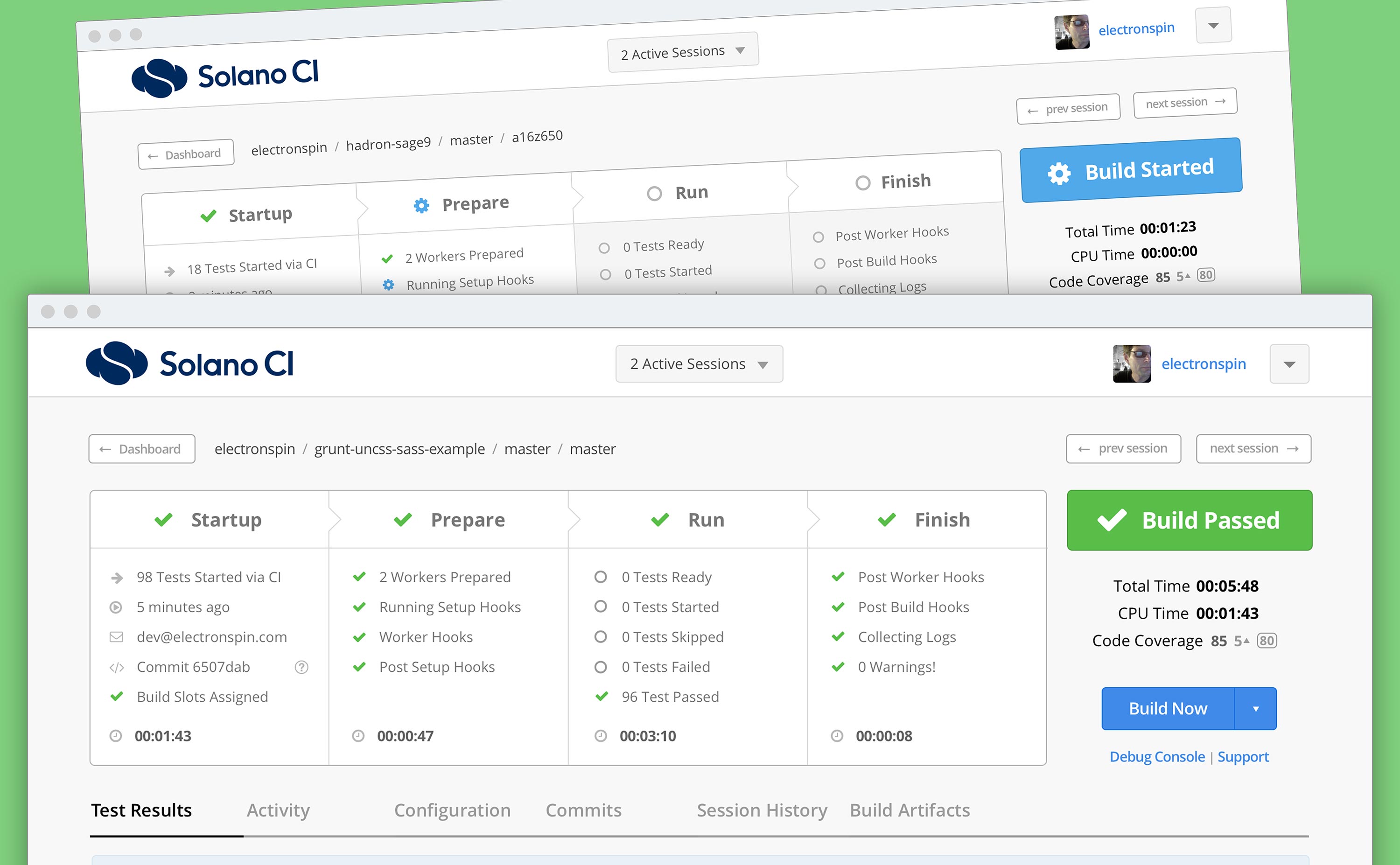
The new Session View increases the value and accuracy of the status report with a simplified, intuitive interface and a clear, precise data visualization. We increased user confidence in the system and overall trust in Solano CI.
Discovery
User Research
We studied customer feedback from support channels, and our team of engineers using Solano CI provided valuable insights.
I led customer interviews and contextual inquiries with key customers to better understand the challenges they faced.
Technology Research
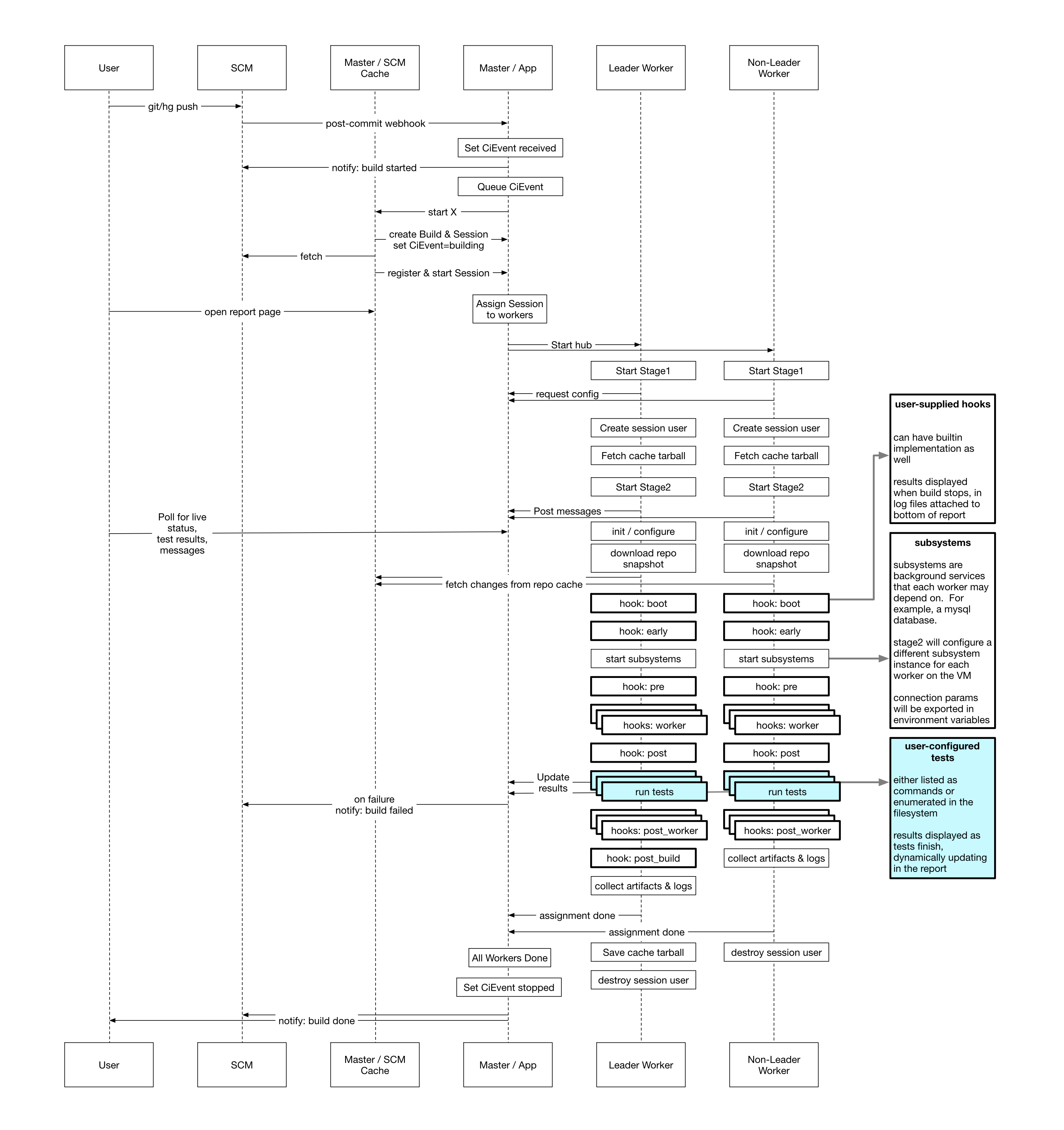
I facilitated internal research to audit how a wide variety of software languages and test suites performed across our entire backend platform. The goal was to look for patterns—success, failure, accuracy—to find a solution to the critical customer trust issue.
Approach
My rationale was that if we radically simplify the session view to present only the most critical status and timing info, as well as ensure all data points are 100% accurate, we could improve both usability and customer trust.
Ideation & Design
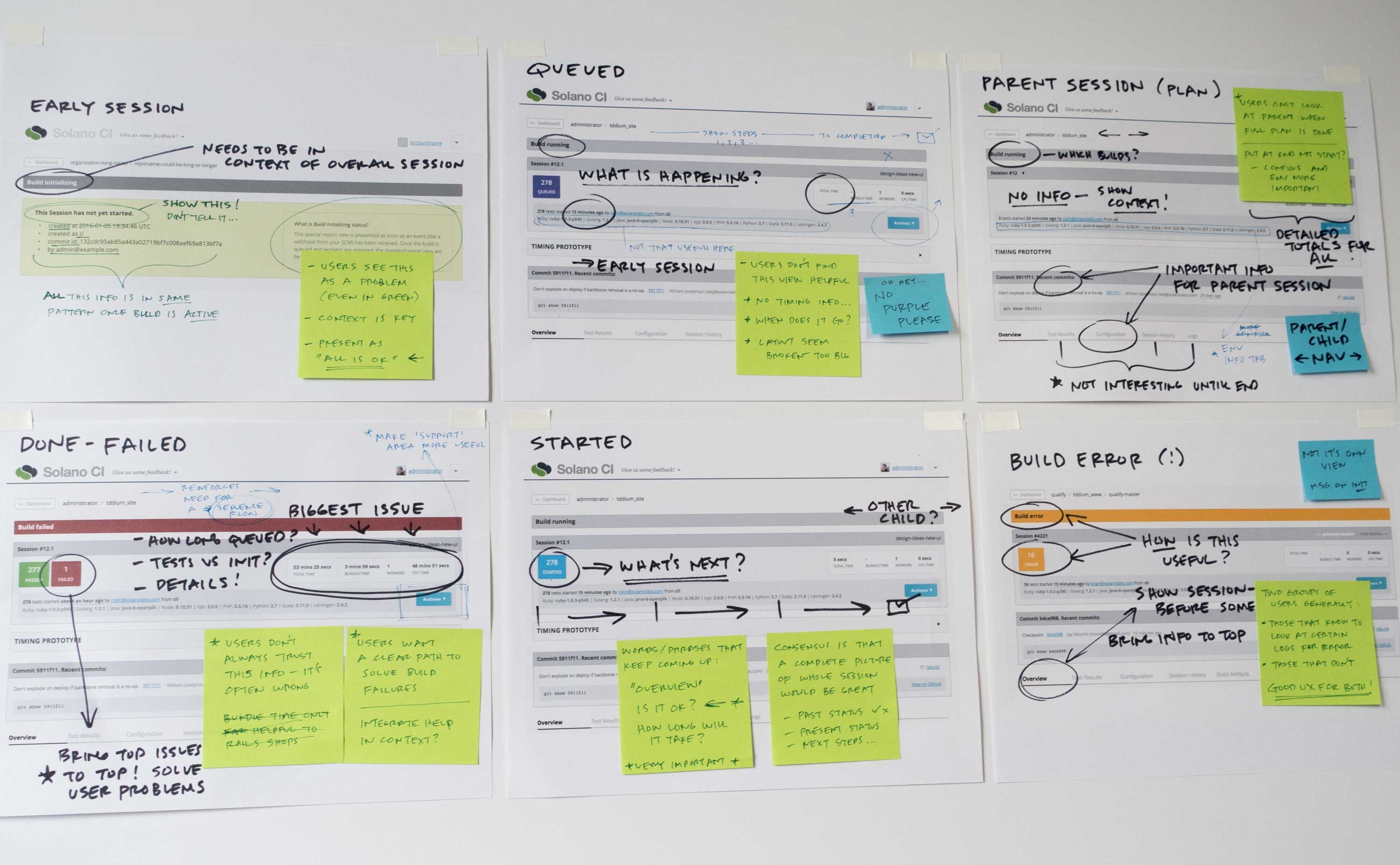
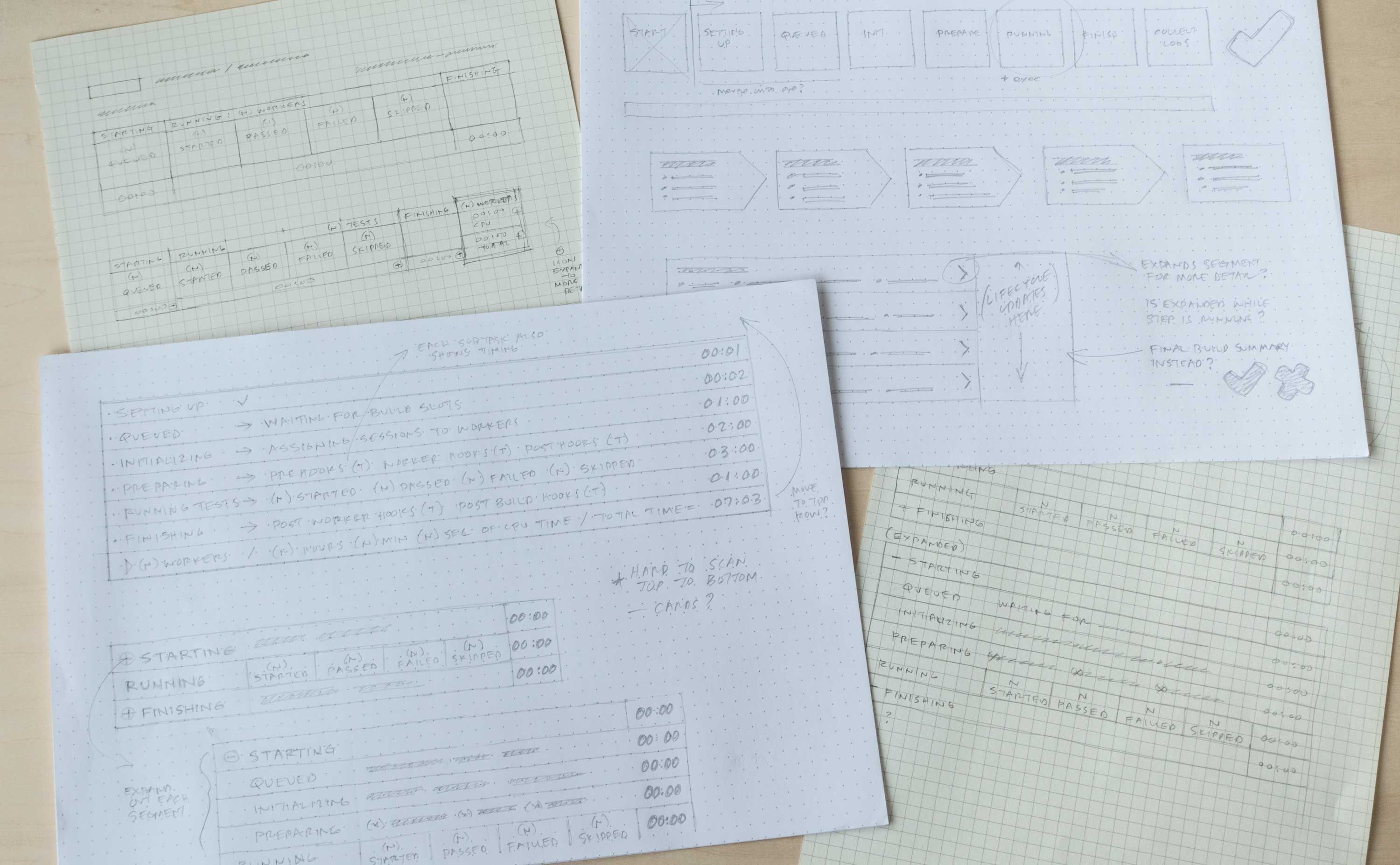
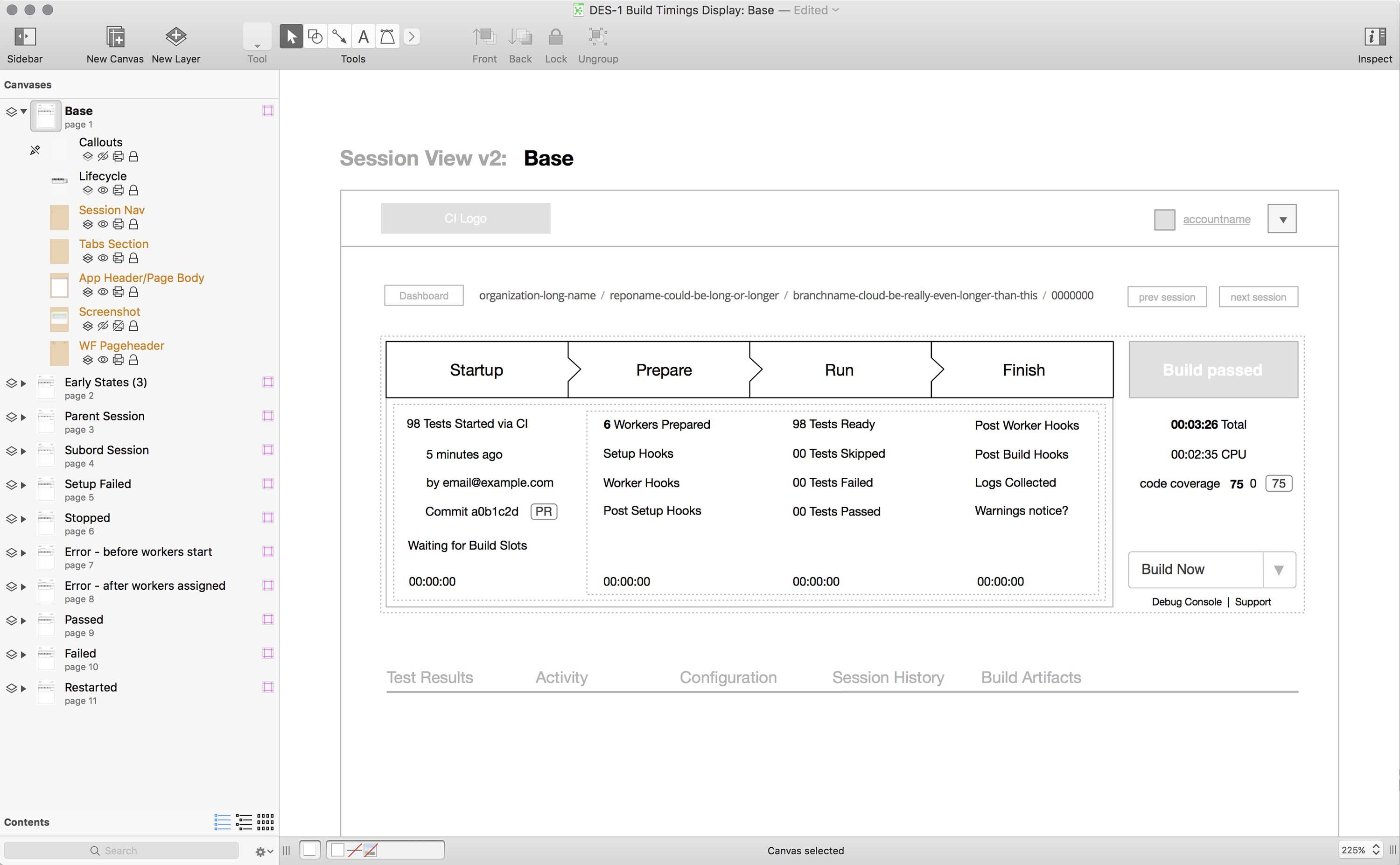
Early Concept Sketches & Wireframes
Using research findings I set out to create a new interaction model for the session view that prioritized ease-of-use and increased trust in the data presentation.
Design Objectives for a Better Experience
Based on research and user analysis, I prioritized solutions to these problems:
- Impossible to get a complete overview of build status
- Inconsistent views for different session types causes high cognitive load
- Poor discoverability of important data that leads to expensive errors
- Inaccurate or incomplete reporting data reduces overall trust in the system
Prototype & Test
Prototyping for User Testing
Through a process of moderated and unmoderated user testing we sought to reveal where we hit the mark with our solution, and where it might need improvement. I iterated on the designs multiple times informed by these user tests.
Real-world Testing
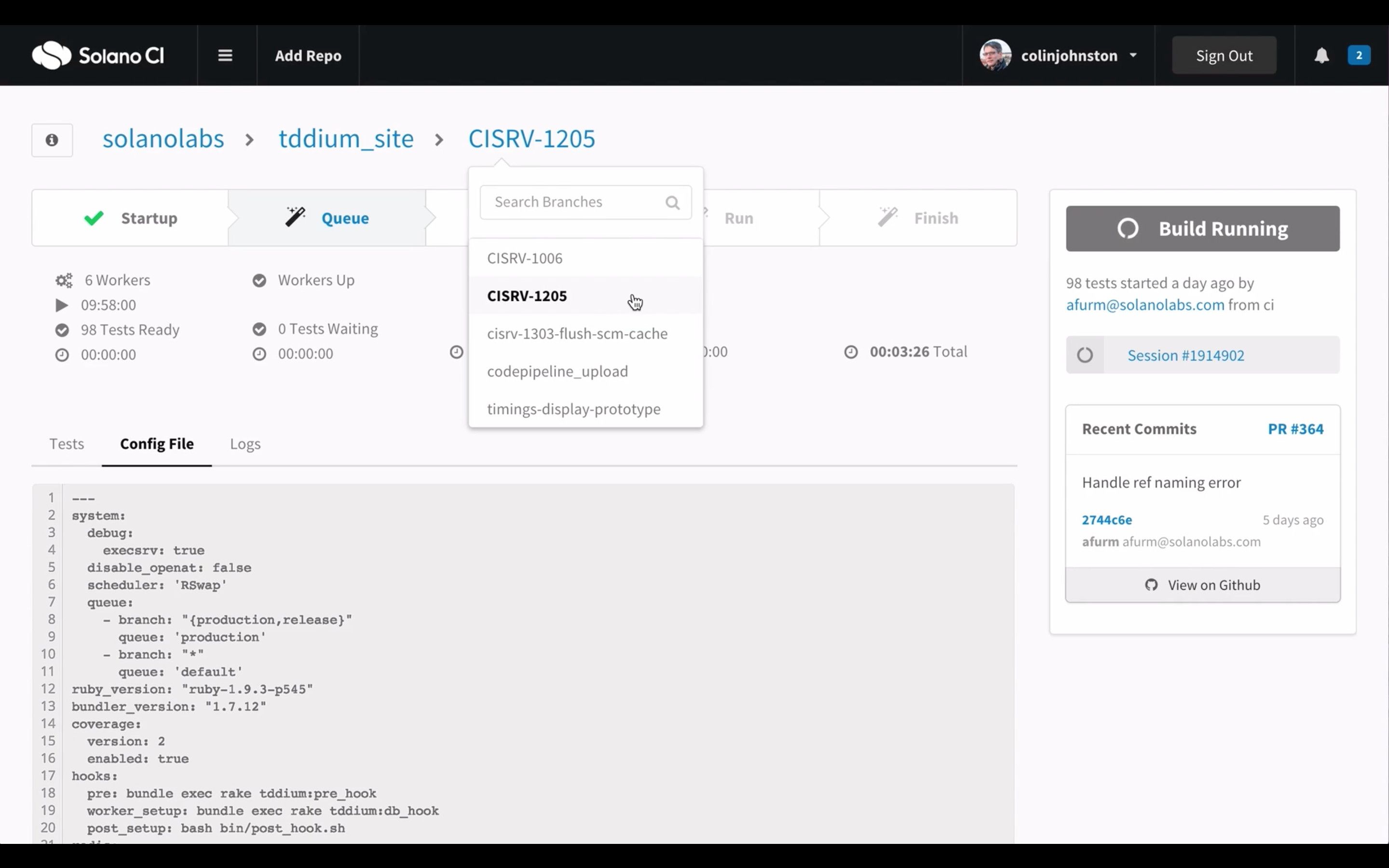
There was no practical way to deliver our initial prototype to customers using real-time data, so the engineering team built the new session view into the production app. We then allowed users to test it as an ‘alpha’ feature behind a feature flag.
Final Design
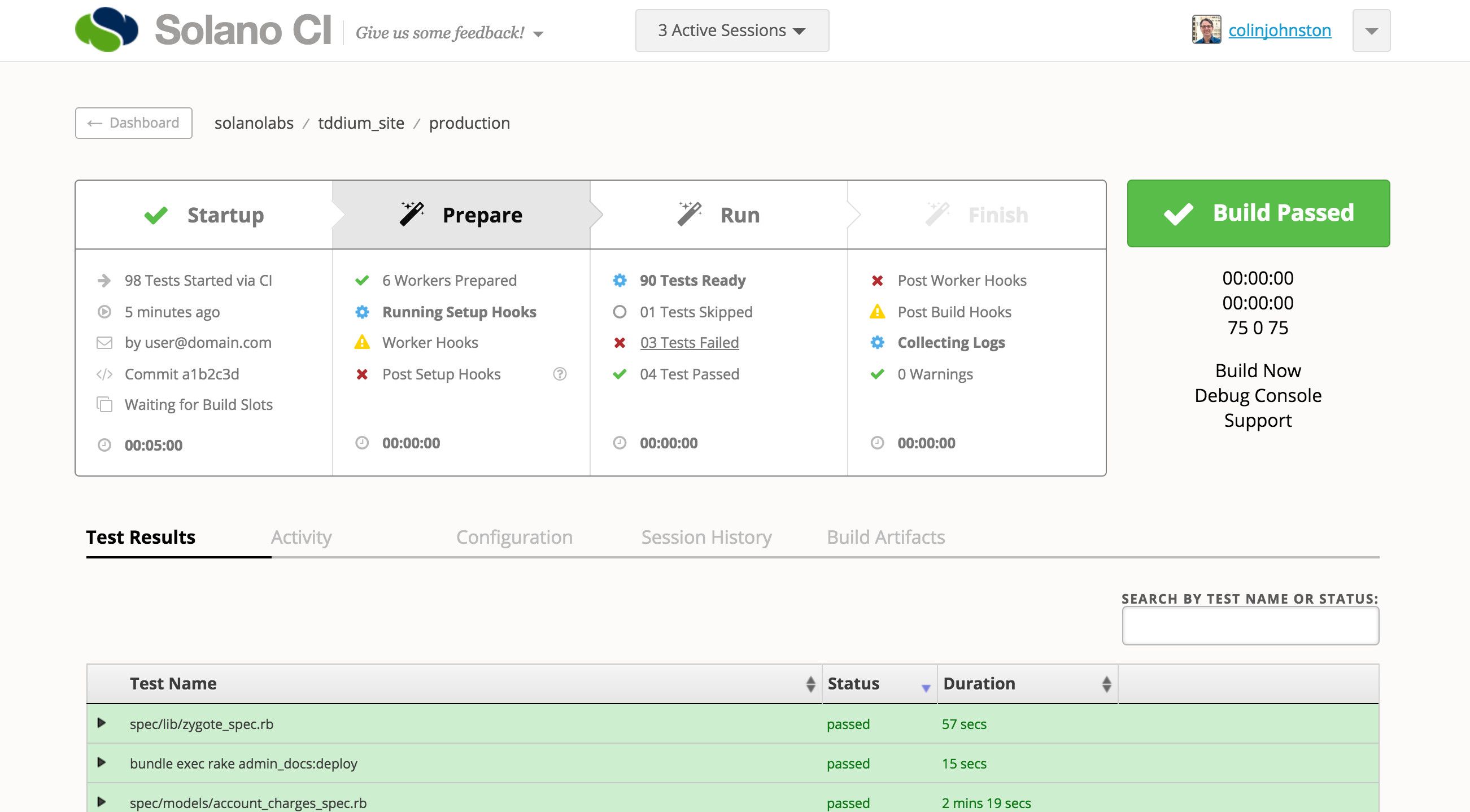
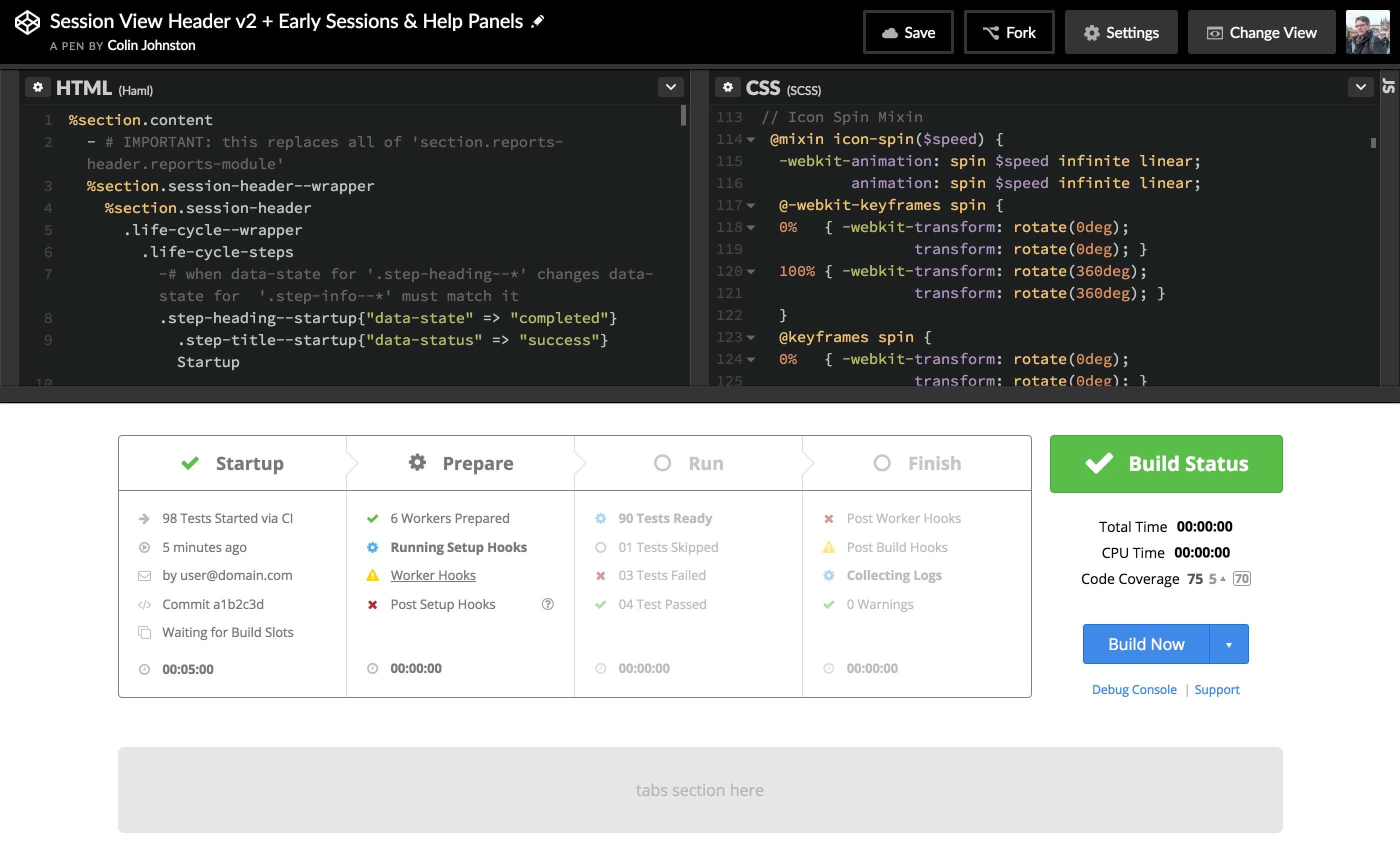
Mock-ups in HTML & CSS
The final visual design was crafted using our component and styles from our work-in-progress design system.
Since we had very hi-fidelity wireframes and a well-defined set of styles for the UI, it was more efficient to create a browser-based prototype rather than static mock-ups.
Delivery
The new session view solved all the issues we set out to solve: we improved accuracy and depth of detail of the status report, while making it more usable and easy to understand; we increased user confidence in the system, and are providing customers with a more efficient tool for a critical part of their software development workflow.
