Paul Saffo Website
Website and identity design for forecaster Paul Saffo.
Project Overview
Context
Paul Saffo is a forecaster and futurist. He explores the dynamics of large-scale, long-term change; he teaches forecasting at Stanford University, chairs the Future Studies and Forecasting track at Singularity University, and serves on the board of the Long Now Foundation.
Problem
Paul has a rich collection of content—journal entries, essays, and interviews—and is a well-known brand in Silicon Valley and internationally.
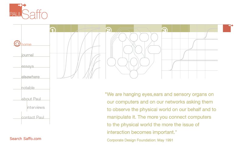
Paul’s existing website was no longer providing his current or potential clients with an experience that would enable him to sustain and grow his business.
Outcome
A refreshed visual and brand design that expresses the rational, intellectual clarity of Paul’s forecasting work and the inventiveness of Paul himself.
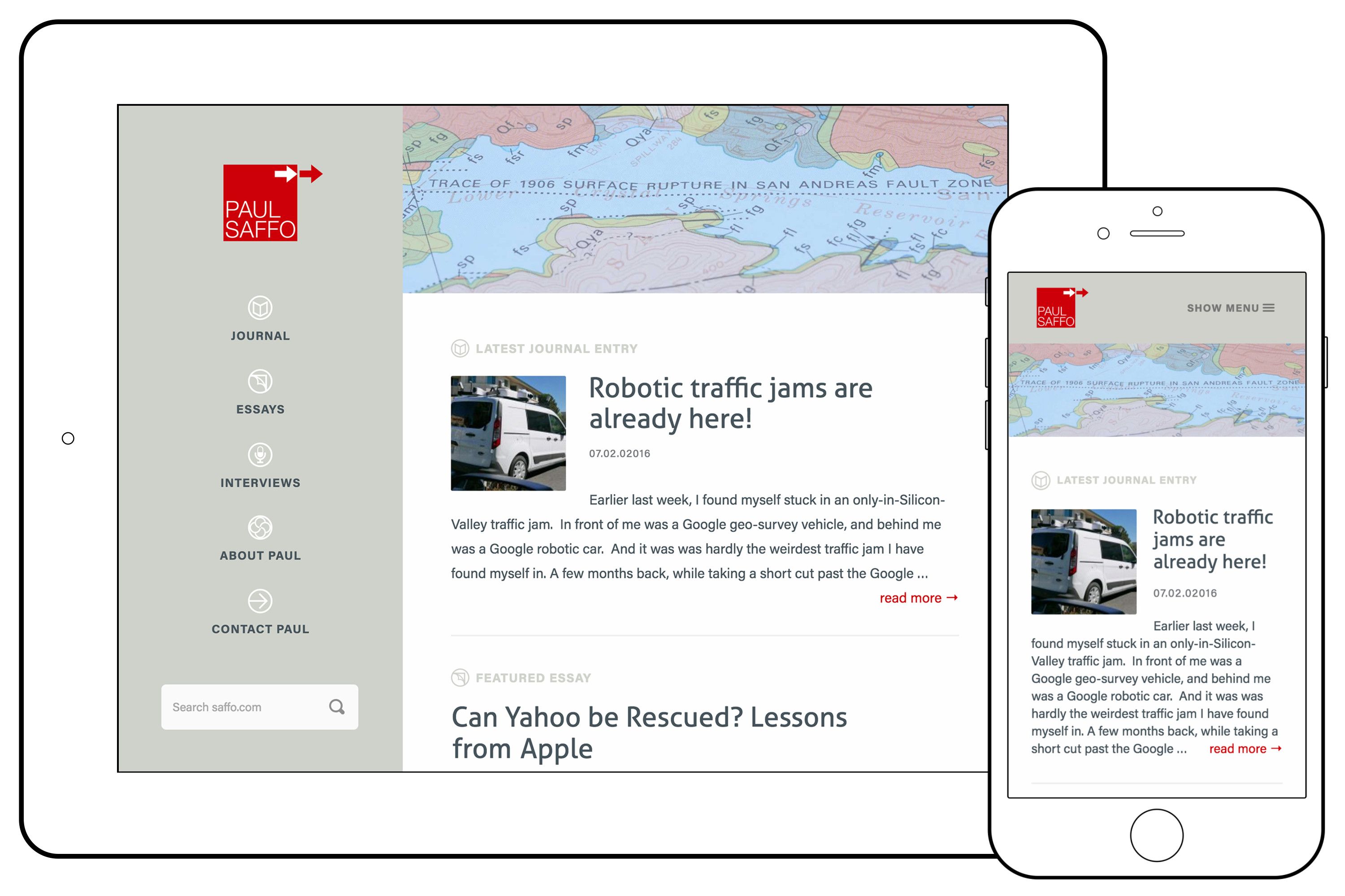
The new site delivers an improved user experience and makes Paul’s large collection of content accessible across a wide variety of devices; it has impressed many key clients and prospects, and helped him book a considerable number of new speaking engagements.
Ideation
Sketches
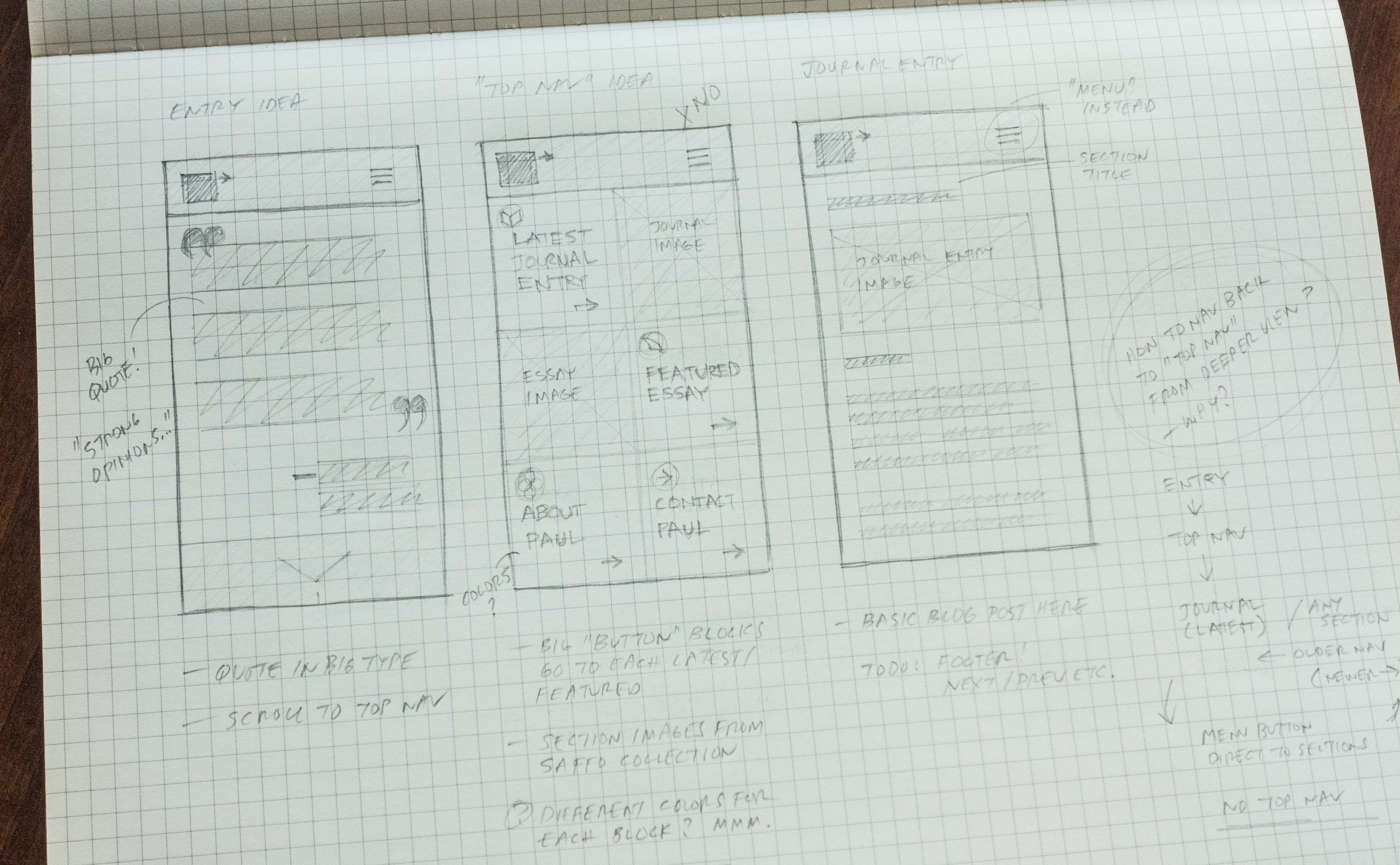
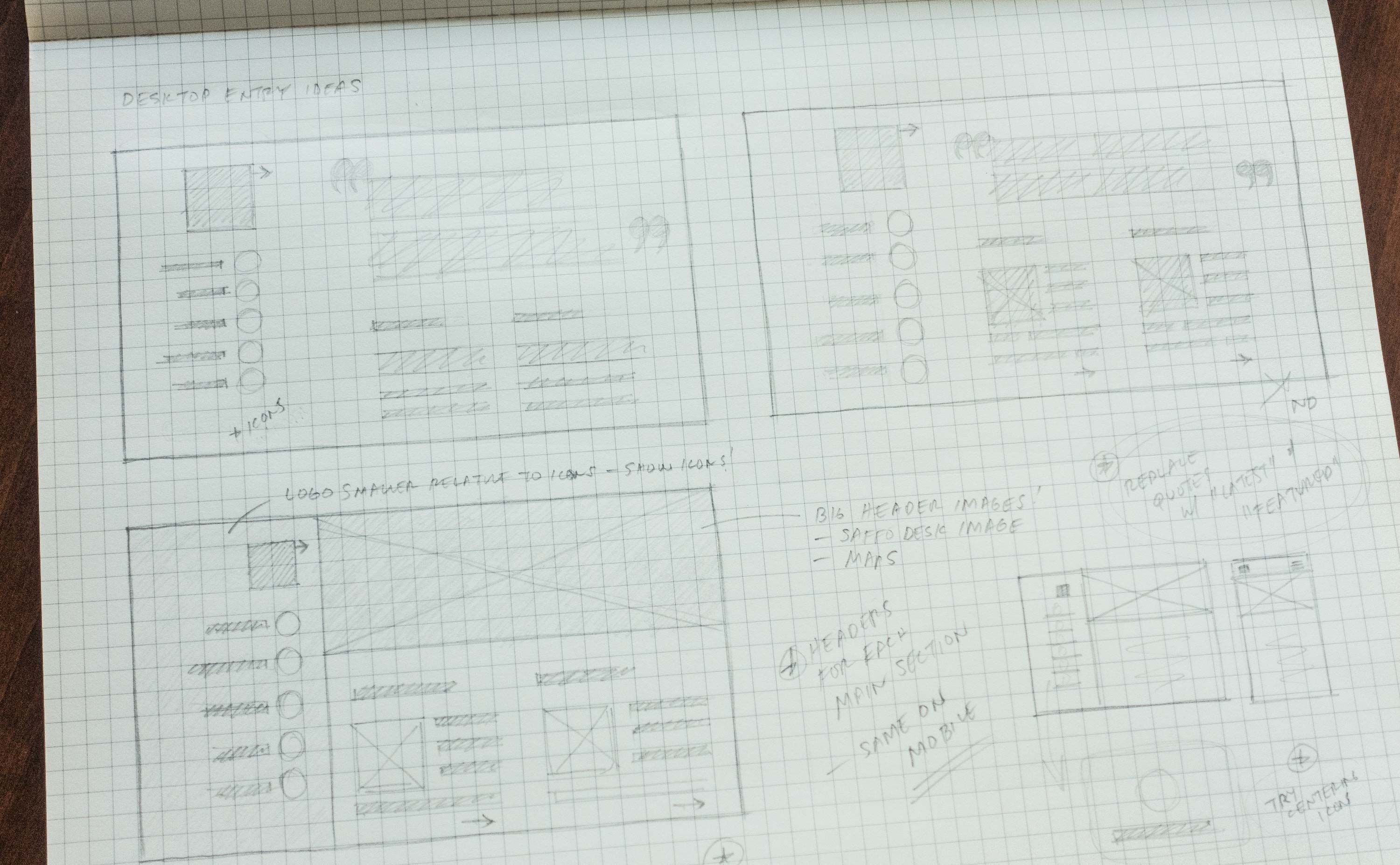
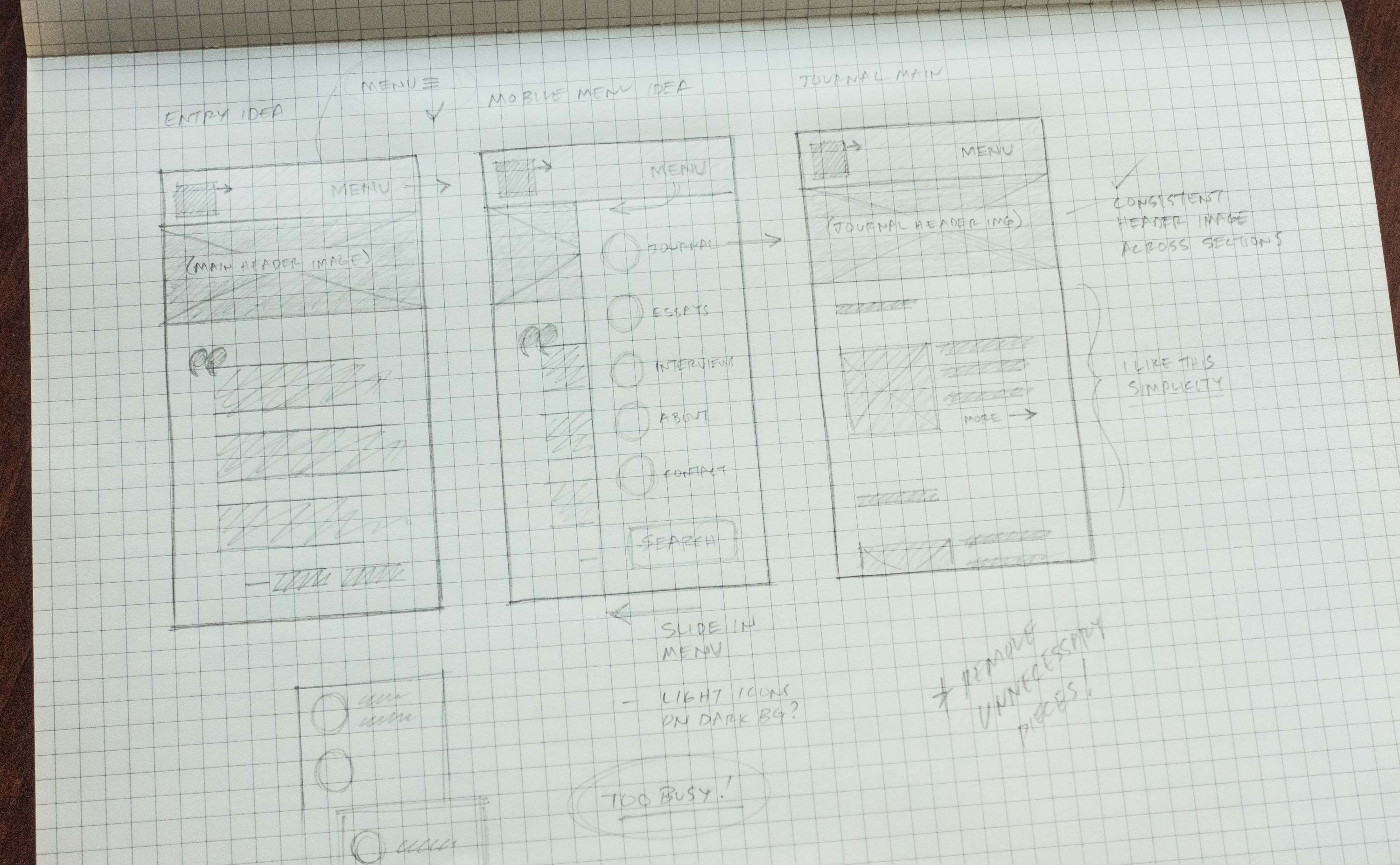
I created numerous sketches to find ways of simplifying a potentially complex interface down to its essentials.
For this project, I was also particularly focused on setting the stage for a more integrated identity and prominent iconography.
Visual Design
Branding & Aesthetics
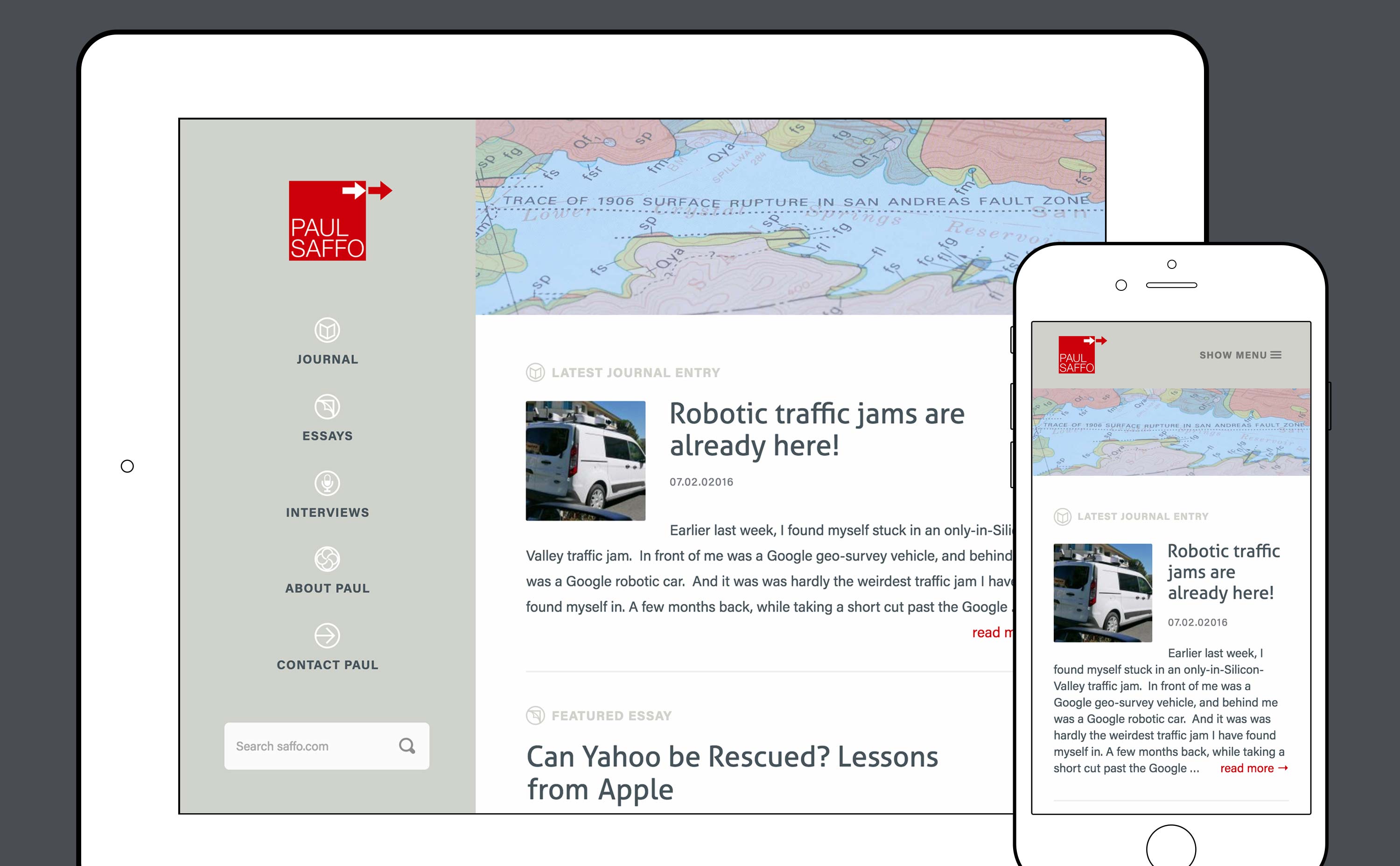
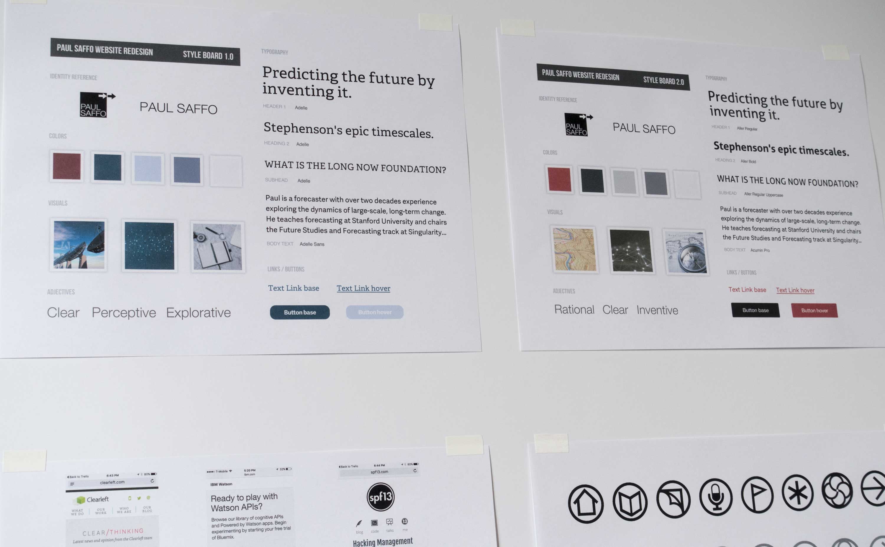
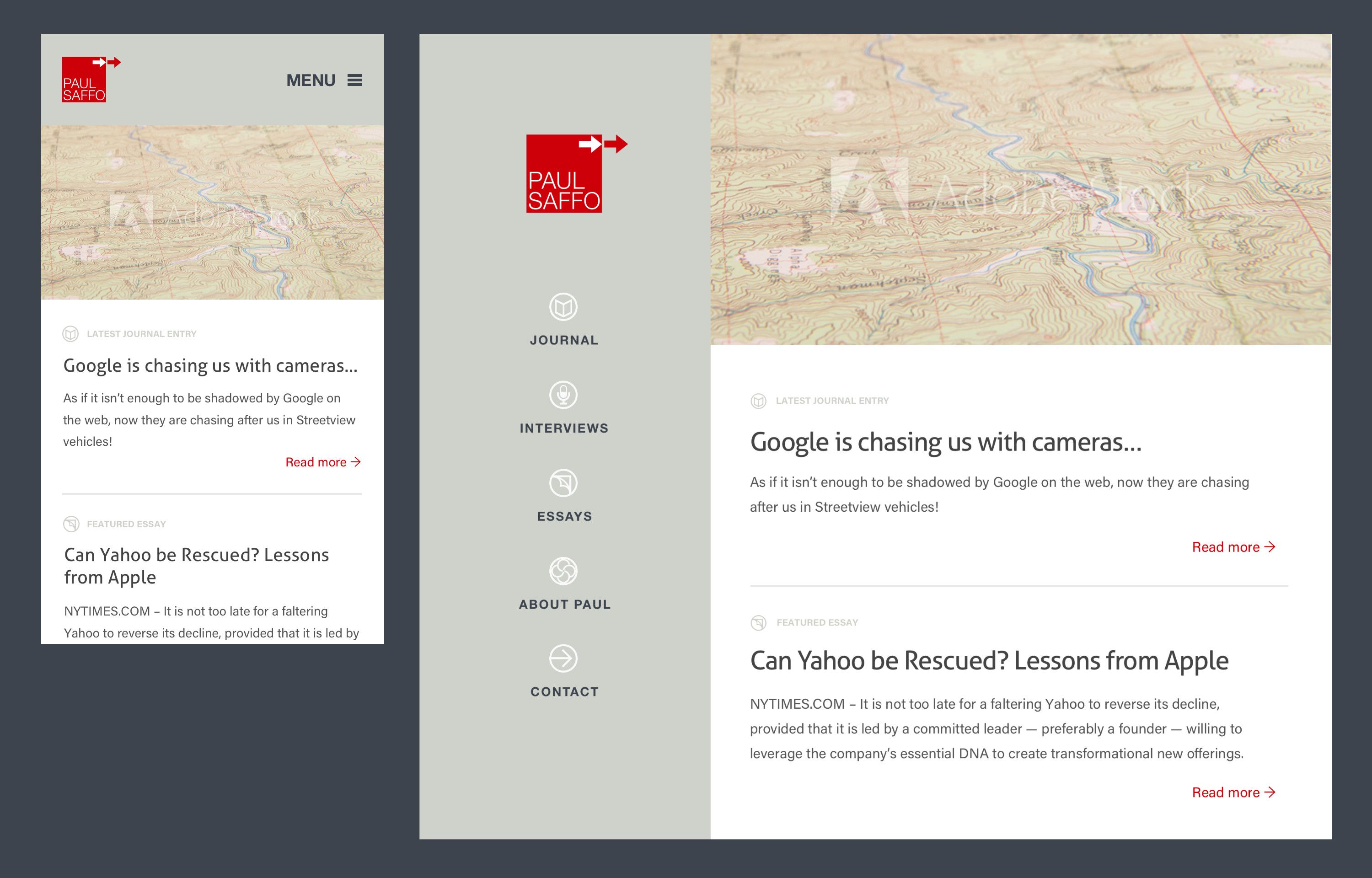
My visual design strategy was to frame the entire site in the updated brand, which is anchored by the new logo (which I previously redesigned) and supported by the icons and updated color scheme.
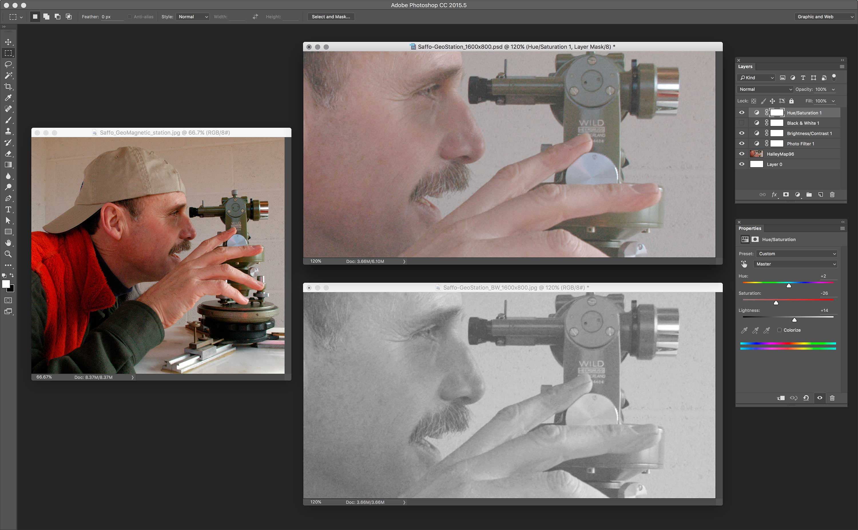
I framed the content in each section with a large header image that signals what is within it. Some of these headers are very literal; others are ‘stories’ that become clearer once you acquire more knowledge of Paul’s content.
Iconography
Custom Icon System
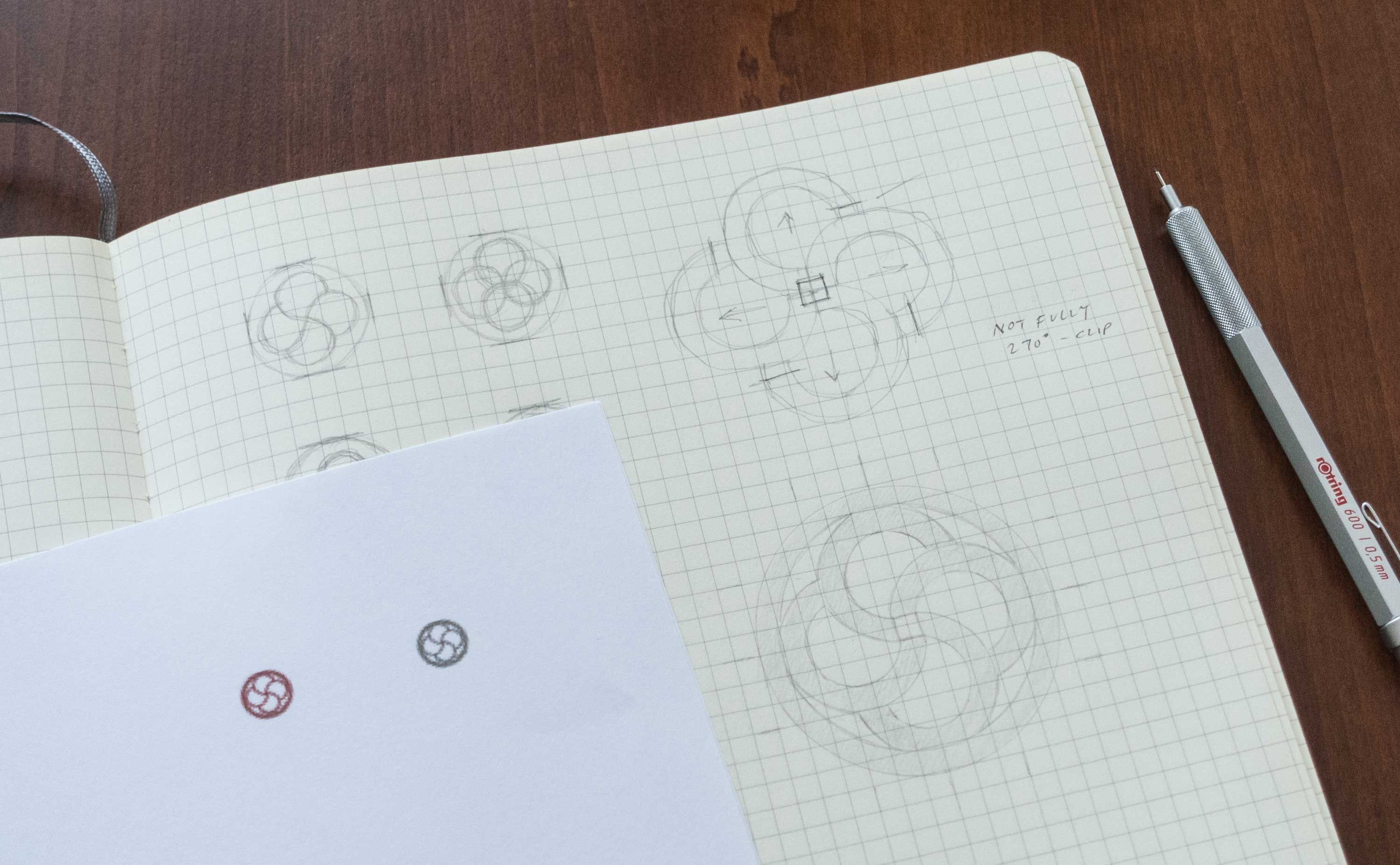
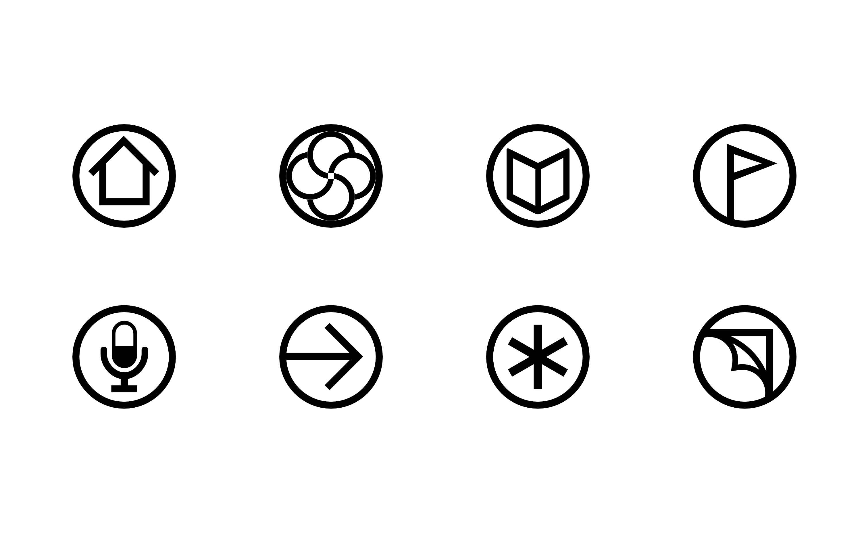
Paul is known for his love of maps. I designed a set of icons that evokes navigation and wayfinding.
The icons serve functionally in the site navigation component, but also serve as a bridge to Paul’s brand identity—in the final desktop site I feature them prominently.
Final Design
Multi-device Mock-ups
I design the desktop and mobile views side-by-side to ensure visual consistency.
